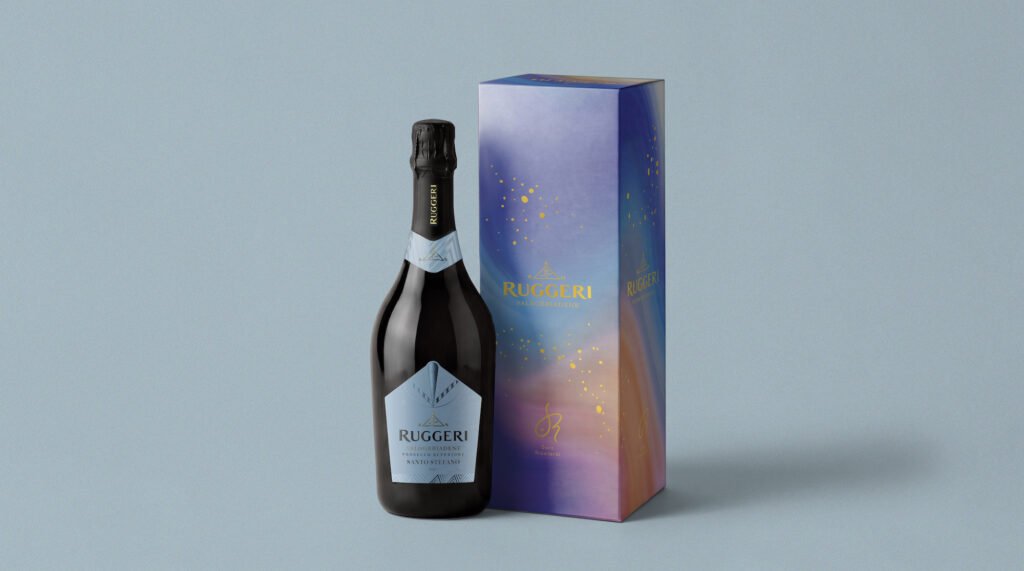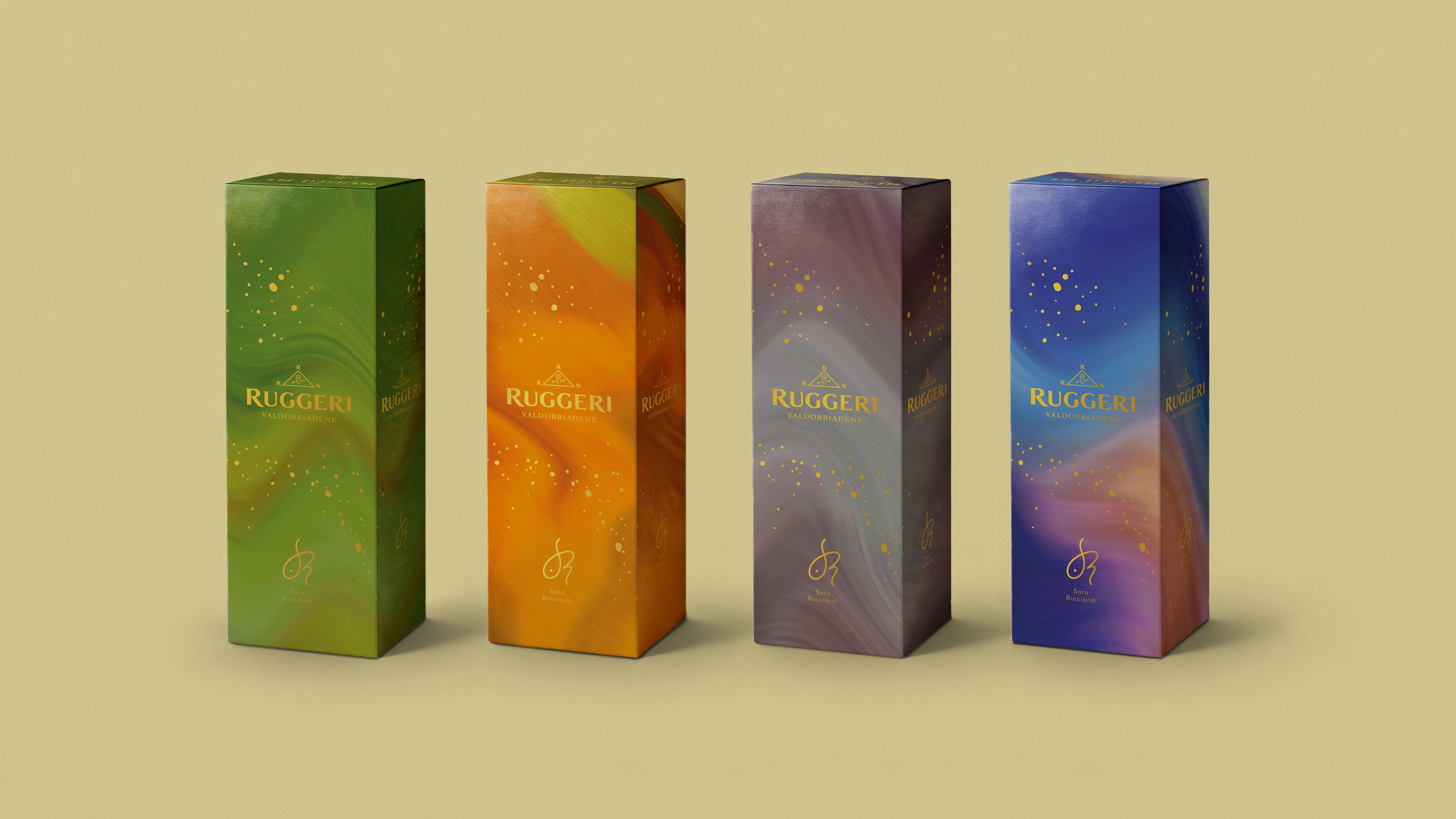
The historic Ruggeri winery presents at Vinitaly 2026 the new look of the I Classici line, a collection that captures the essence of Valdobbiadene Prosecco Superiore Docg through four iconic labels: Giall’Oro, Quartese, Saltèr and Santo Stefano. The restyling stems from the desire to narrate, with a contemporary language, the symbols and rituals of the territory, transforming elements of tradition into an essential and vibrant design.
The new labels interact with an artistic reinterpretation by Sara Ricciardi, who has translated the shapes and colors of the Valdobbiadene hills into a bold, sensorial universe. A line that returns to center stage with a renewed identity, capable of uniting history, style and the recognizability of a unique terroir.
A new design born from tradition
The I Classici line has always represented the foundations of Ruggeri. The four labels share a common origin: the steep slopes of Valdobbiadene, a land of heroic harvests recognized as a UNESCO World Heritage site. Today, this identity is expressed through a restyling that draws from the symbols of local culture.
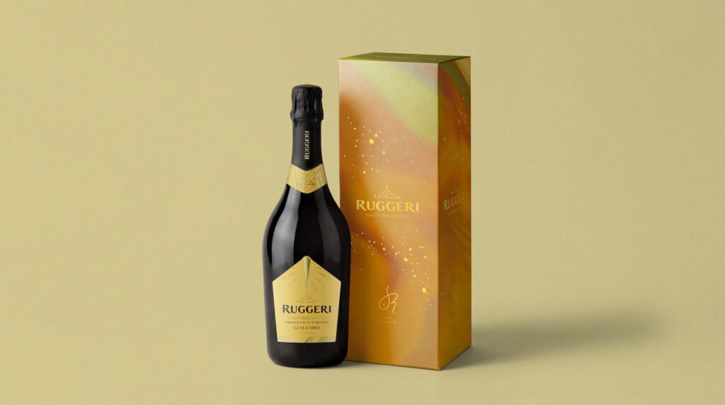
The new labels are inspired by the sundial, which for generations has marked the rhythm of vineyard work, and by the unusual headgear of the ancient vineyard guardians. Tools, signs and memories become essential graphic elements, interpreted with intense, contemporary colors. The result is an image that preserves its historical roots while speaking a modern, immediate and recognizable language.
The artistic vision of Sara Ricciardi
To complete the project, Ruggeri involved artist and spatial designer Sara Ricciardi, who reinterpreted the Valdobbiadene landscape through a sensorial lens. Her vision transforms the hills into vibrations of light and color, into “chromatic glitches” that evoke the sparkle of prosecco and the joy of a toast.
This aesthetic takes shape in the line’s packaging, conceived as collectible objects. The surfaces come alive with fluid, dynamic shades, creating a bridge between the territory’s tradition and a more artistic, contemporary imagination. It is a new way of narrating Valdobbiadene, through visual emotions that anticipate those in the glass.
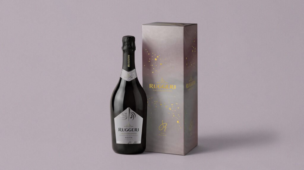
I Classici: four identities, one soul
The line is composed of four labels, each with its own distinctive character yet united by the same territorial matrix.
- Giall’Oro is the Extra Dry that brightens every occasion. Its name recalls the golden grapes and the sundial, symbol of time and light in Valdobbiadene. The bouquet ranges from yellow apple to acacia flowers, supported by a fine and persistent perlage. It pairs beautifully with fish, raw scampi, white meats and delicate cheeses.
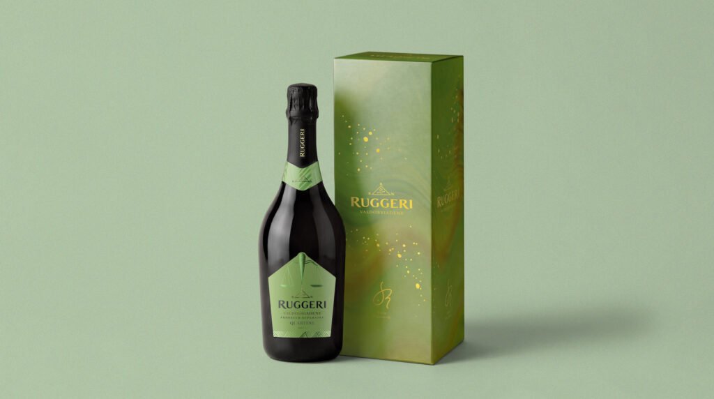
- Quartese, Saltèr and Santo Stefano complete the collection, each offering its own interpretation of Valdobbiadene Prosecco Superiore Docg. Together, they express the complexity of the territory, from the most favored exposures to the micro‑areas that define each wine’s personality.
The I Classici line continues to represent Ruggeri’s history and identity, now with a look that looks to the future and enhances the symbolic strength of its territory.